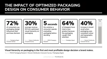
According to a 2018 Ipsos survey commissioned by the Paper and Packaging Board, 72% of U.S. consumers say packaging design often influences their purchase decisions. That's not a small nudge — that's the majority of your customers making judgments before they've tried a thing.
The challenge? Balancing visual appeal, structural choices, brand consistency, regulatory requirements, and print-ready production all at once. This guide walks through each step — from what to gather before you design to the mistakes that send projects back to square one.
Key Takeaways
- Great packaging protects the product, communicates value, and reflects brand identity at a glance
- Gather vector logos, CMYK color codes, and approved fonts before any design work begins
- Choose your structure and format before committing to visual design
- Simplicity and clear hierarchy outperform cluttered, over-designed packaging every time
- A print partner who reviews files before production prevents costly reprints and missed deadlines
What Makes Product Packaging Design Effective
Effective packaging works across four dimensions: visual appeal, structural functionality, informational clarity, and emotional resonance. Miss any one of them and the others have to compensate.
Visual Presentation
Color, typography, imagery, and hierarchy work together to guide the eye. NielsenIQ BASES data shows optimized package designs generate an average 5.5% lift in forecasted revenue — even when the product hasn't changed.
Visual hierarchy matters too. EyeSee research found that weak packaging hierarchy can reduce brand recall by 25–30% in shelf simulations. The customer's eye needs a clear path: what to notice first, second, and third.
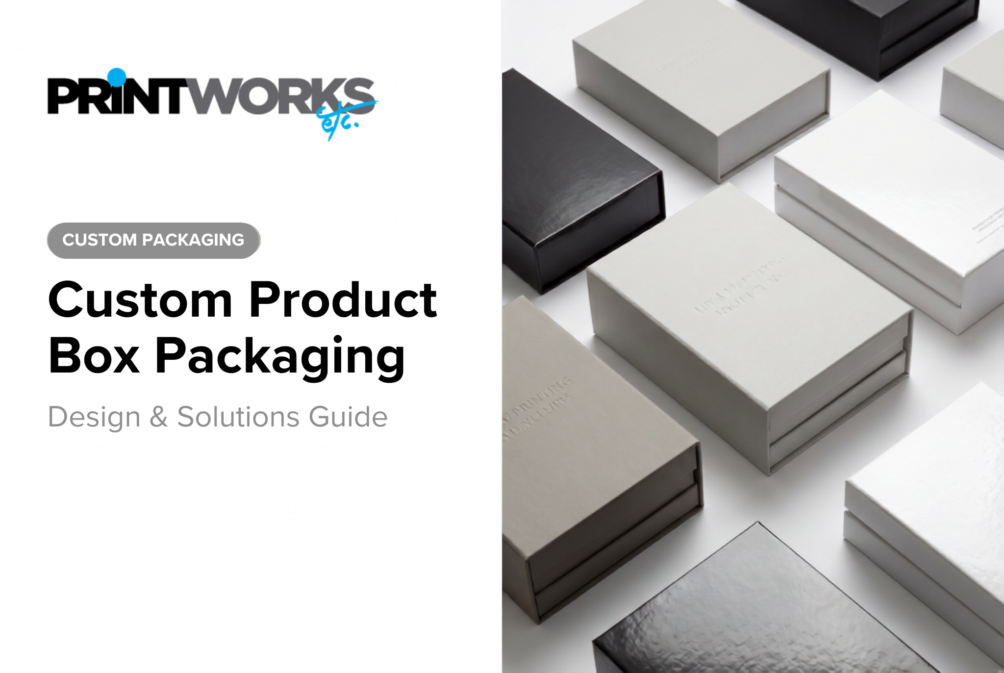
Structural and Material Choices
The physical form communicates before any graphics do. A kraft box signals natural and artisan. Glossy rigid board feels premium. Matte paperboard reads sophisticated. 67% of consumers say packaging materials specifically influence their purchase decisions — separate from the design printed on them.
Structure determines usability too: easy to open, right-sized for the product, stable on a shelf, and protective enough for shipping.
Information Effectiveness and Brand Consistency
Packaging has limited real estate. The front panel needs to answer two questions instantly: what is it and why should I care. Secondary panels handle supporting details. The back carries depth, instructions, and required information.
Brand consistency is where packaging earns its place in the broader marketing mix. Logo placement, color system, typeface choices, and copy tone should align with your website, social content, and marketing materials. Marq reports that consistent brand presentation can increase revenue by 10–20% — packaging is a major touchpoint in that consistency equation.
Emotional Resonance and Storytelling
The most memorable packaging creates a feeling — luxury, playfulness, nostalgia, eco-consciousness — and that feeling is the result of deliberate choices, not happy accidents. Origin stories, ingredient transparency, and craftsmanship cues woven into copy and visuals build a connection that outlasts the transaction.
Specific techniques that drive emotional resonance include:
- Origin storytelling — where the brand came from and why it exists
- Ingredient or material transparency — what's inside and why it was chosen
- Craftsmanship cues — details that signal hand-finishing, small-batch production, or premium sourcing
- Purposeful copy tone — voice that matches the feeling (warm, witty, bold, minimal)
Before You Design: What to Gather First
Starting a packaging project without the right assets is like building a house without a blueprint. Here's what to collect upfront.
Brand Assets Checklist
- Provide a vector logo file — not a JPEG or PNG. Vector files scale without degradation and are required by virtually every print vendor
- Supply CMYK or Pantone color codes, not hex values. Hex is for screens; CMYK is how printers mix ink. Sending hex values to a printer invites color surprises on press
- Include approved typefaces with any usage guidelines around weight, size, and kerning
- Share your brand guidelines if they exist — they prevent drift during design
Content Requirements
Every element that must appear on the packaging needs to be identified before the layout begins. This includes:
- Product name and description
- Ingredients, materials, or specifications
- Usage or care instructions
- Barcode (UPC or GTIN — GS1 standards apply for retail distribution)
- Certifications, seals, or regulatory marks
- Net weight and manufacturer details
- Legal copy specific to your product category
One practical note on variable data: expiration dates, lot numbers, and batch codes should not be printed directly onto packaging. Leave a designated blank zone for a sticker or stamp applied post-production. If you're unsure how to set this up, PrintWorks Etc can walk you through the right variable data workflow for your packaging project.
Budget and Scope
Packaging budgets split into two buckets:
- One-time costs: design work, dieline creation, print plate setup
- Per-unit costs: materials, finishing, assembly, shipping
Define a ballpark budget before design begins. It directly informs whether a custom structure or stock structure makes sense, which print method (digital vs. offset) is appropriate, and which finishes are realistic.
How to Design Product Packaging: A Step-by-Step Process
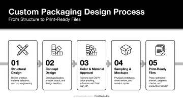
Step 1 — Choose Your Packaging Structure
Structure decisions happen before any visual design. The right format depends on:
- Product properties — fragile, perishable, heavy, oddly shaped
- Sales channel — retail shelf requires shelf stability and front-panel prominence; e-commerce shipping requires structural durability and unboxing consideration
- Customer experience goals — a simple tuck-end box serves utility; a magnetic-closure rigid box creates occasion
Common formats include folding cartons, mailer boxes, rigid setup boxes, pouches, tubes, labels, and sleeves. If you're unsure which structure fits your product, a packaging partner like PrintWorks Etc can handle dieline engineering and structural mockups before you commit to a direction.
Step 2 — Build the Visual Concept
Research competitor packaging before committing to a direction. Understand the visual language of your category, then decide: blend in or stand out?
Every visual decision — palette, typography, imagery — should reflect brand personality and speak directly to the target customer. Chasing trends without anchoring to brand identity produces packaging that feels generic within 18 months.
Step 3 — Design the Layout and Messaging
Each panel has a distinct job:
- Front panel — communicates one message: what it is and why it matters. Leave subtlety and excessive copy for the secondary panels.
- Secondary panels — add supporting context, brand story elements, and secondary product information.
- Back panel — provides depth: full ingredients or materials, usage instructions, legal information, barcodes, and certifications.
The balance between copy and visuals is where most packaging goes wrong. If someone picks up your product and can't immediately identify what it is, the design has already failed its primary job. Clarity wins.
Step 4 — Mock Up and Test Before Committing
Print a rough version. Fold it. Photograph it on a shelf, in someone's hands, in a shipping context. Look for:
- Hierarchy issues — what's drawing the eye first, and is that correct?
- Awkward proportions between panels
- Readability problems at small sizes or in low light
- Any copy that reads differently in physical form than it did on screen
Physical mockups catch problems that no screen preview will show. Structural mockups and 3D renders — both part of PrintWorks Etc's packaging process — routinely surface proportion and readability issues that would otherwise reach production.
Step 5 — Prepare Print-Ready Files
Sending files to a printer without proper preparation is one of the most common and expensive mistakes in packaging production. Required specs include:
- Correct dieline template — artwork must align to the exact structural file
- CMYK color mode — not RGB. Colors that look right on screen can shift dramatically in print
- 300 DPI minimum image resolution — anything lower risks blurry output on press
- Bleed extended beyond the trim line — prevents white edges after cutting
- Fonts embedded or outlined — prevents substitution errors on the printer's system
PrintWorks Etc's creative team provides dieline templates, conducts prepress file reviews, and manages Pantone/CMYK color approval with factory partners before any production run begins. That review step alone eliminates the most common causes of reprints.
Product Packaging Design Tips to Make Your Product Stand Out
Keep It Simple and Clear
One strong message almost always outperforms a crowded design. White space isn't wasted space — it gives key elements room to breathe and signals confidence in the product.
Match Packaging to Brand Personality
- Playful brands: bright colors, expressive typography, energetic imagery
- Premium or luxury brands: restrained palettes, minimal layouts, soft-touch lamination or spot UV finishes
- Natural or artisan brands: kraft substrates, earthy tones, handwritten-style typography
The packaging should feel like it belongs to the same family as the brand's website and marketing materials. If someone who knows your brand picks up your product, it should feel immediately recognizable.
Prioritize the Unboxing Experience
For e-commerce brands, the delivery box is the store. Dotcom Distribution research found that 61% of online shoppers say premium packaging makes a brand seem more upscale — and Shorr Packaging found that premium shoppers were 15% more likely to make a repeat purchase when packaging is premium.
Branded components that elevate the unboxing experience:
- Custom tissue paper
- Branded tape
- Custom inserts (foam, paper, or fabric)
- Thank-you cards or info cards
- Sticker seals
- Custom void fill
Coordinating all of these pieces across vendors is where it gets complicated. PrintWorks Etc manages sourcing, kitting, and fulfillment coordination for DTC brands and subscription box programs — end to end.
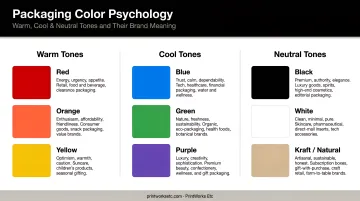
Use Color and Typography Strategically
Packaging color directly shapes how shoppers perceive a product before they read a single word. A 2023 systematic review in Foods confirmed that color affects perceived healthfulness, emotional response, and purchase intent.
Practical guidelines:
- Warm colors (red, orange, yellow) — energy, urgency, appetite
- Cool colors (blue, green) — calm, trust, cleanliness
- Neutral/black — sophistication, premium positioning
- Limit your palette to 2–3 colors for cohesion
Typography carries tone just as color does. Serif fonts read as trusted and traditional; sans-serif reads modern and clean; handwritten styles feel personal and artisanal.
Avoid mixing more than two type families on a single package — beyond that, the design starts to feel unresolved.
Consider Sustainability Thoughtfully
82% of consumers are willing to pay more for sustainable packaging, according to Trivium Packaging's 2023 Buying Green Report of over 9,000 consumers. That number has only grown as younger consumers prioritize it at the shelf.
Sustainable materials aren't always cost-competitive, though — some bio-based alternatives carry significant price premiums. The practical move is to reduce over-packaging first (smaller box footprint, less material overall), then make eco-conscious swaps where they don't push per-unit costs past your margin threshold.
Common Packaging Design Mistakes to Avoid
Technical File Errors
These are preventable and consistently expensive:
- Low-resolution images — anything under 300 DPI prints blurry. No exception.
- RGB color mode — colors can shift dramatically when converted to CMYK for press
- Missing bleed — artwork that doesn't extend past the trim line creates white edges after cutting
- Artwork not aligned to the dieline — panels land in the wrong position after cutting and folding
A single prepress mistake can cost more than the print job itself once you factor in wasted substrate, press time, plates, and overtime. Preflighting files before production — a standard step PrintWorks Etc builds into every project — catches these issues before they become expensive surprises.
Over-Designing and Unclear Messaging
Technical errors aside, creative missteps are just as costly — they just show up at the shelf instead of in the pressroom.
Too many fonts. Too many colors. Too much copy competing for attention. The result is a package that communicates nothing effectively, even though it tried to say everything.
If a customer needs to study your packaging for 10 seconds to understand what the product is, the design has a hierarchy problem.
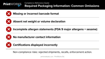
Missing or Incorrect Required Information
Regulatory requirements vary by product category, but the consequences of non-compliance are consistent: rejected retail shipments, product recalls, and potential enforcement action.
Common omissions that cause problems:
- Missing or incorrect barcode format
- Absent net weight or volume declaration
- Incomplete allergen statements — the FDA mandates nine major allergens, with sesame added January 1, 2023 under the FASTER Act
- No manufacturer contact information
- Certifications displayed incorrectly or without authorization
Leave a dedicated blank zone for variable data — expiration dates and lot numbers added post-production via stamp or sticker, not printed directly onto the package.
Frequently Asked Questions
What are the key elements of effective product packaging design?
Effective packaging combines four elements: visual presentation (color, typography, imagery, and hierarchy), structural functionality (material and physical form), informational clarity (required content in a logical hierarchy), and emotional resonance with the target customer. All four need to work together. A visually strong package with confusing information still underperforms.
How does packaging design impact sales and brand recognition?
Packaging influences purchase decisions within seconds, reinforces brand identity across retail and e-commerce channels, and builds recognition over time. Consistent execution also supports higher perceived value — research from Pregis found that premium packaging produced a 32% higher perceived product value versus economy packaging in an e-commerce context.
What is the difference between CMYK and RGB, and why does it matter for packaging?
RGB is the color model for screens — it's additive light. CMYK is how physical printers mix ink on paper. Designing in RGB and sending those files to a printer results in unexpected color shifts because the conversion between color spaces is imperfect. All packaging artwork should be set to CMYK before file submission.
How do I choose the right packaging material for my product?
Consider the product's physical properties (fragility, weight, perishability), sales channel, budget, and sustainability goals. Material also communicates brand tone: kraft signals natural or artisan, glossy paperboard reads premium, matte stock feels sophisticated. A packaging partner can advise on material selection based on both product requirements and brand positioning.
What are the most common packaging design mistakes to avoid?
The most frequent and costly: using low-resolution or RGB images, over-designing with competing fonts and colors, omitting legally required information such as allergen statements or net weight, and skipping a physical mockup before committing to a full production run.
When should I work with a professional print and packaging partner?
When the project involves custom structures, large quantities, premium finishes, regulatory compliance, or tight timelines. PrintWorks Etc handles dielines, file specs, vendor sourcing, sampling, color approval, and production across domestic and overseas factories — removing that coordination burden from your team.